
The failure of high-stakes branding initiatives often traces back to a specific, overlooked interval between the finalization of a strategic brief and the creation of the first visual mockups. This critical junction, increasingly identified by industry experts as the "pre-concept phase," serves as a diagnostic period where abstract brand values are stress-tested and translated into concrete design parameters. Without this bridge, common descriptors such as "modern," "trustworthy," and "premium" remain dangerously subjective, leading to a disconnect between a company’s strategic intent and its visual execution.
The Crisis of Ambiguity in Brand Identity Development
In the contemporary design landscape, the "gap" between strategy and execution has become a primary driver of project friction. When a branding project fails, the breakdown rarely occurs during the final logo rendering; instead, it happens during the strategy phase when key adjectives are left undefined. In professional branding environments, designers are frequently inundated with inputs—briefs, stakeholder interviews, and competitor audits—yet they are expected to intuit a "correct" visual direction without a shared definition of what "correct" entails.
Industry analysis suggests that the subjectivity of language is the greatest risk factor in creative workflows. For example, a stakeholder requesting a "premium" aesthetic may envision a minimalist, editorial layout, while another may associate the term with ornate, high-contrast gold-and-black color palettes. This semantic misalignment necessitates a pre-concept phase: a rigorous period of research into brand context and the uncovering of hidden assumptions before any original design work commences.
Chronology of a Strategic Brand Development Cycle
To mitigate the risks of misalignment, a standardized chronology has emerged among top-tier design consultancies. This process replaces the traditional "big reveal" of design concepts with a collaborative, incremental narrowing of possibilities.
- Project Kickoff and Strategic Briefing: The collection of business goals, target demographics, and market positioning.
- Discovery and Contextual Research: An investigation into the competitive landscape and category-specific visual codes.
- The Pre-Concept Phase: The translation of verbal strategy into visual boundaries through stakeholder workshops and perception mapping.
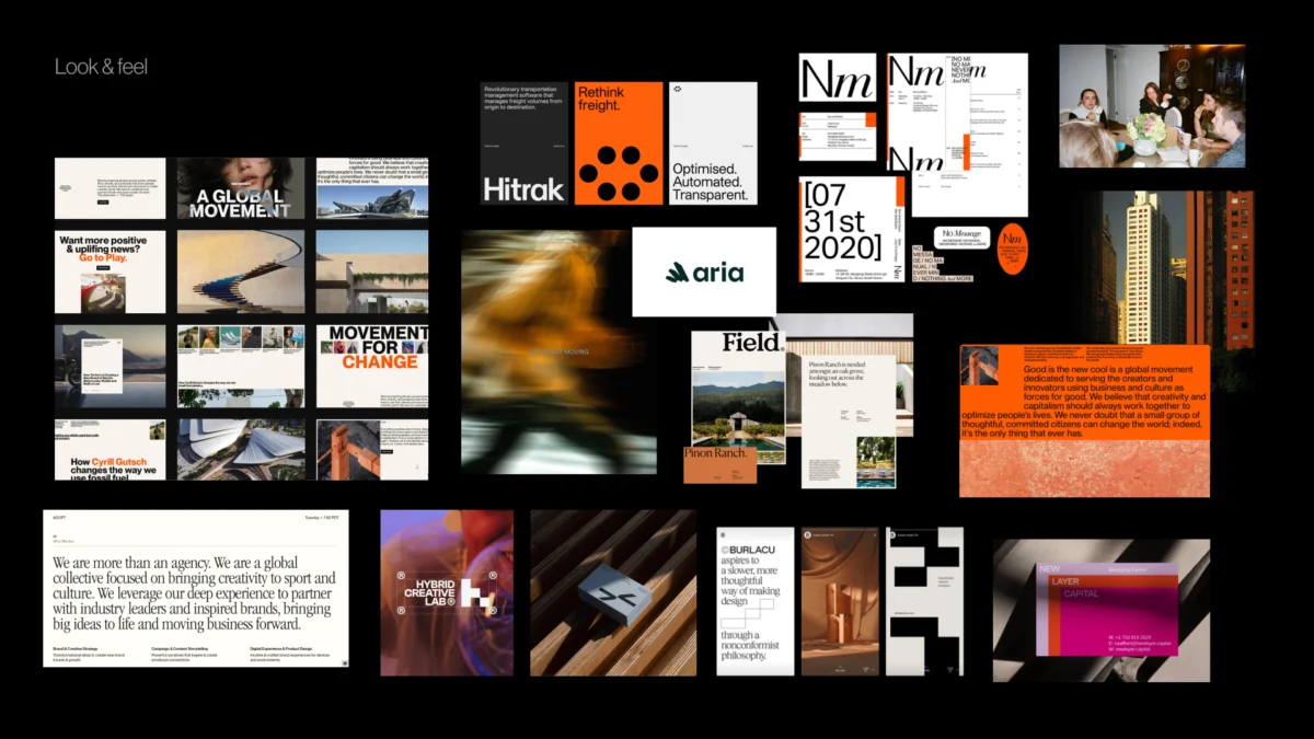
- Visual Foundation Establishment: The creation of "Look and Feel" boards and design codes that define the project’s aesthetic guardrails.
- Concept Development: The execution of original logos, typography, and color systems within the agreed-upon boundaries.
- Implementation and Asset Generation: The rollout of the brand across digital and physical touchpoints.
By isolating the pre-concept phase, organizations can resolve internal disagreements at the "moodboard" level, where adjustments are cost-effective, rather than at the "final asset" level, where revisions can cost thousands of dollars in lost labor.

Case Study Analysis: Navigating Conflicting Brand Drivers
The importance of the pre-concept phase is best illustrated through real-world applications in high-pressure sectors such as healthcare and financial technology.
The Healthcare Paradox: Disruptive vs. Credible
In a recent engagement with a health-tech startup, the client’s strategic brief emphasized a desire to be "disruptive, modern, and trustworthy." In a vacuum, the word "disruptive" might lead a design team toward bold, rebellious typography and neon color palettes characteristic of the Silicon Valley "move fast and break things" ethos.
However, during the pre-concept workshop, it was revealed that the startup’s primary clients were government-run medical institutions. In this specific context, "disruption" did not mean rebellion; it meant superior efficiency and clarity. A visual system that felt too experimental would undermine the "trustworthy" pillar of the strategy. Consequently, the visual foundation was shifted toward high-legibility typography and structured, modular layouts—a "traditional" interpretation of disruption that aligned with the audience’s expectations of institutional credibility.

The Fintech Tension: Boldness vs. Security
Similarly, a fintech firm sought a "bold" brand identity to differentiate itself from legacy banks. While "bold" often implies oversized graphics and high-vibrancy palettes, the pre-concept phase identified a necessary tension: the brand had to signal security and competence. Through competitor perception mapping, the team identified that the brand’s "boldness" should be expressed through confident use of negative space and a sophisticated, understated color story, rather than visual noise.
Supporting Data: The Economic Impact of Design Alignment
Data from the Design Management Institute (DMI) and McKinsey & Company underscore the financial imperative of structured design processes. McKinsey’s "Business Value of Design" report, which tracked 300 publicly listed companies over five years, found that those with the strongest design practices outperformed the industry benchmark by a ratio of two to one.
Crucially, the report highlighted that the most successful firms are those that treat design as a cross-functional responsibility, rather than a siloed creative department. The pre-concept phase is the practical application of this finding; it forces stakeholders from marketing, product, and executive leadership to align on visual metaphors before capital is deployed for production. Industry estimates suggest that 50% of a designer’s time can be wasted on "re-work" caused by poor initial alignment, making the pre-concept phase a significant driver of operational efficiency.

Methodology: Tools for Visual Translation
During the pre-concept phase, designers utilize specific exercises to extract actionable data from stakeholders.
Competitor Perception Mapping
Stakeholders are asked to plot competitors on a two-axis map (e.g., Traditional vs. Progressive and Understated vs. Bold). This exercise rarely results in immediate consensus; instead, it exposes differing perceptions of the market. If two executives disagree on whether a competitor is "premium," the designer has uncovered a semantic gap that must be resolved before the brand’s own "premium" identity can be built.
The Visual Brand Driver Exercise
This metaphor-based tool asks stakeholders to associate the brand with unrelated categories, such as transport, furniture, or architecture. If a brand is described as a "high-speed train" (implying speed and reliability) by one stakeholder and a "bicycle" (implying eco-friendliness and agility) by another, the design team identifies a fundamental strategic contradiction. Resolving these metaphors creates a "design code"—a set of visual principles that guide the choice of shapes, textures, and compositions.

Official Responses and Industry Perspectives
Design leaders across the industry have voiced support for a more rigorous pre-visual process. Jake Knapp, author of Sprint and creator of the GV Brand Sprint, has noted that the goal of these exercises is to transform abstract ideas into something concrete. "The point is not to get a perfect answer, but to surface the assumptions that will otherwise come back to haunt the project during the final review," Knapp stated in a recent discourse on brand strategy.
Furthermore, editorial experts at Smashing Magazine emphasize that the strongest visual concepts do not start in software like Figma; they start with the right questions. The consensus among senior creative directors is that the "surprise reveal" of a logo is a relic of 20th-century advertising that is increasingly incompatible with the iterative, data-driven nature of 21st-century product design.
Broader Impact and Implications for Global Brands
As brands move toward "digital-first" identities, the pre-concept phase becomes even more vital. Digital products require a "design system"—a library of reusable components that must remain consistent across various platforms. If the foundational "design code" is not established early, the resulting system will lack cohesion, leading to a fragmented user experience.

The shift toward a pre-concept framework represents a professionalization of the branding industry. By treating visual identity as a problem-solving exercise rooted in research and stakeholder alignment, agencies can deliver results that are not only aesthetically pleasing but also strategically sound. This approach reduces the reliance on "creative intuition" and replaces it with a transparent, defensible methodology.
In conclusion, the pre-concept phase is the ultimate safeguard against the subjectivity of the creative process. It ensures that when the first visual concept is finally presented, it does not feel like a guess or a surprise. Instead, it feels like the logical, inevitable conclusion of a shared strategic journey. For organizations looking to build long-term brand equity, the investment in this "pre-work" is no longer optional—it is the foundation of design excellence.

