
The global digital health sector is currently grappling with a measurable crisis of engagement, as new data reveals that the vast majority of mental health applications fail to retain users beyond the first few days of interaction. While the market for "mHealth" solutions has expanded rapidly over the last decade, reaching a valuation of tens of billions of dollars, the clinical efficacy of these tools is being undermined by a fundamental design-user mismatch. Research indicates that approximately 95% of users who download a mental health app abandon it within 30 days, with a median 30-day retention rate of just 3.3%. Even market leaders and industry "unicorns" experience a severe drop-off, losing roughly 50% of their active user base within the first ten days of installation.

This collapse in retention is increasingly being attributed to a conflict between contemporary User Interface (UI) trends and the cognitive requirements of individuals in distress. In a space defined by vulnerability, the pursuit of visual innovation often introduces "cognitive friction," forcing users to expend mental energy they do not have. As mental health conditions like anxiety and depression continue to rise globally, the industry is facing a reckoning: effective interface design is no longer a matter of aesthetics, but a clinical and operational priority.

The Cognitive Cost of Trend-Driven Design
Modern UI trends are frequently optimized for "attention capture" and the signaling of technological innovation. Patterns such as "neo-brutalism," characterized by high-contrast layouts and stark borders, or "minimalist" navigation that relies on hidden menus and non-standard gestures, are designed to stand out in a crowded digital marketplace. However, for a user accessing an app during a period of high anxiety or executive dysfunction, these patterns become barriers to care.

According to research published in the Journal of Medical Internet Research (JMIR), users in a state of mental distress experience a significant reduction in cognitive capacity. Tasks that seem trivial to a healthy user—such as interpreting an unlabeled icon or navigating a multi-step onboarding flow—can become insurmountable for someone experiencing brain fog or an acute panic attack. When an interface demands high cognitive effort at the exact moment support is required, it provides the user with a direct reason to disengage.

Clinical data suggests that the "Utility-Trust" nexus is the foundation of mental health app success. If a user cannot find a calming exercise or a crisis contact within seconds because the navigation is "innovative" rather than "standard," the trust in the tool’s ability to provide refuge is permanently eroded.

Chronology of the mHealth Design Shift
The evolution of mental health app design can be categorized into three distinct phases, each reflecting broader shifts in the technology landscape:

- The Clinical Era (2010–2015): Early apps were often digital translations of clinical worksheets. They were functional but visually sterile, resembling medical software rather than consumer products.
- The Gamification Boom (2016–2021): Influenced by the success of apps like Duolingo and Headspace, designers began integrating streaks, rewards, and bright, "bubbly" aesthetics to encourage daily use. This era saw a surge in venture capital and user acquisition but began to show signs of "gamification fatigue" among clinical populations.
- The Crisis of Retention (2022–Present): As global anxiety levels spiked following the COVID-19 pandemic, the limitations of "one-size-fits-all" UI trends became apparent. Designers like Kat Homan and other industry experts began advocating for "state-aware" design, focusing on reducing cognitive strain rather than maximizing screen time.
Data Analysis: The Retention Gap
The disparity between general app retention and mental health app retention highlights a unique challenge in the sector. While a high-performing social media or e-commerce app might maintain a 30-day retention rate of 25% to 40%, mental health apps struggle to stay above 4%.

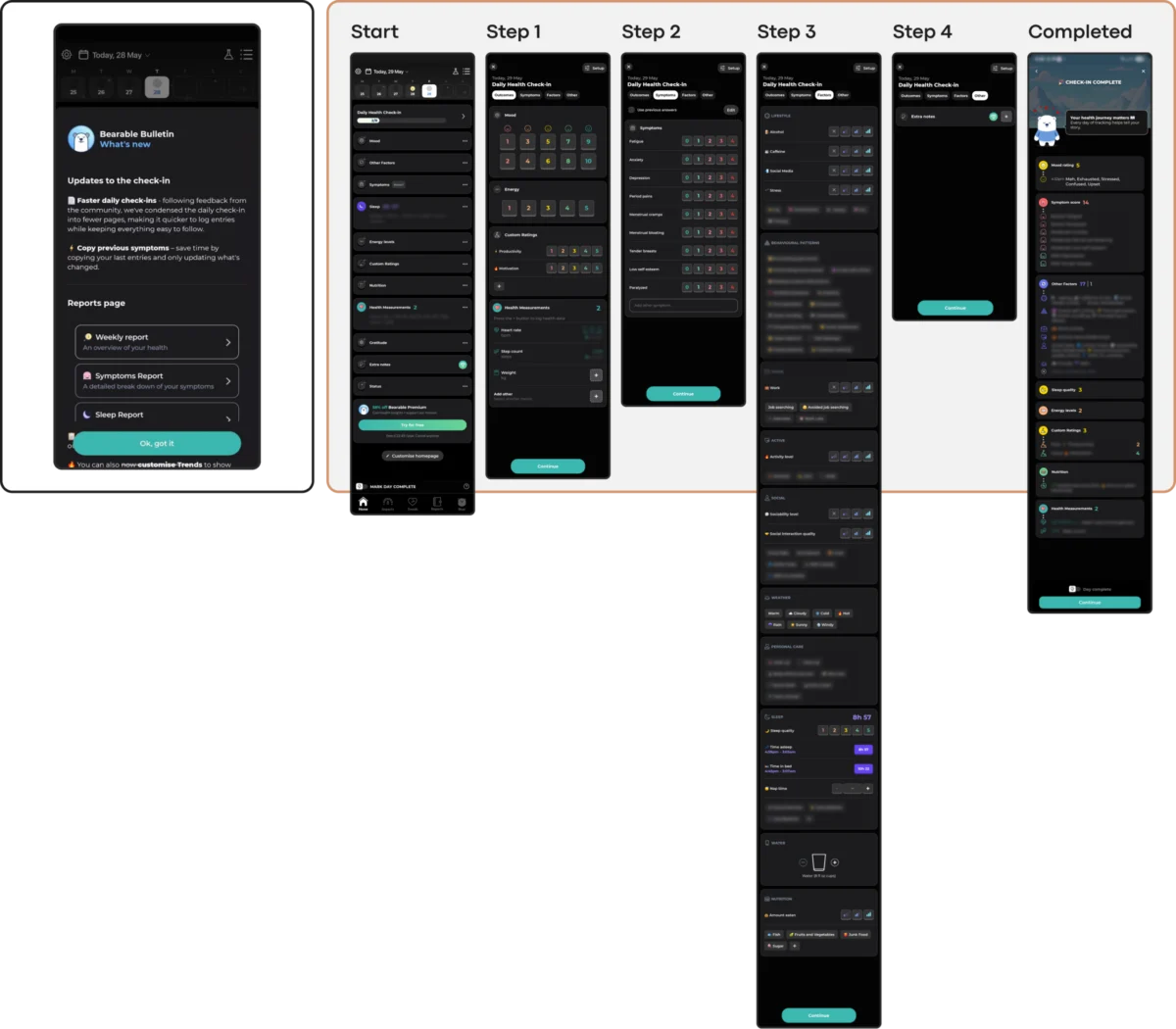
Supporting data from competitive product audits reveals that apps with "dense" dashboards—those that track mood, sleep, symptoms, and medication on a single screen—see higher abandonment rates among users reporting "high distress" compared to those reporting "mild symptoms." For example, the app Bearable provides a powerful, comprehensive tracking suite that is highly valued by chronic illness managers. However, for a user in an acute depressive episode, the executive capacity required to navigate such a dense interface can be prohibitive.

Conversely, "linear" apps like Nonori have seen success by stripping away complexity. By guiding users through a single, non-branching sequence of small actions, these apps reduce the "paradox of choice," meeting the user at their current level of capacity.

Emotional Mismatch and Trust Erosion
A critical factor in the "retention collapse" is the erosion of trust caused by emotional mismatch. Research into how color and aesthetics influence mood in mHealth apps suggests that users in distress often find "cheerful" or "vibrant" palettes to be jarring or even physically uncomfortable.

A study published in Frontiers in Digital Health found that users experiencing depression showed a marked preference for subtle, muted, and sophisticated aesthetics. Bright yellows and aggressive "success" animations can feel dismissive to someone in a low-capacity state. This "aesthetic-emotional conflict" suggests that a style chosen for its trendiness—such as the "glassmorphism" popular in 2023—can alienate the very audience it seeks to serve if it feels too "tech-forward" and not enough like a "refuge."

This mismatch extends to monetization. For instance, the app Calmer provides effective anxiety relief tools, yet some users have noted a dissonance when quiet support is interrupted by "discount wheels" or celebratory confetti after logging a negative mood. These engagement mechanics, while effective in e-commerce, can land as predatory or insensitive in a therapeutic context.

Accessibility as a Clinical Mandate
The World Health Organization (WHO) estimates that over one billion people globally live with a mental disorder. This population disproportionately includes individuals with visual, motor, or cognitive impairments. Despite this, many "trendy" UI choices actively violate Web Content Accessibility Guidelines (WCAG 2.2).

Low-contrast text (a hallmark of certain minimalist styles) fails users with visual impairments. Gesture-only navigation marginalizes those with motor difficulties or tremors. Furthermore, visually dense or highly animated interfaces can be exclusionary for users with ADHD or sensory processing sensitivities. In the mental health space, accessibility is not merely a legal requirement; it is a clinical necessity. A tool that is inaccessible to those in the greatest need is, by definition, a failure of design.

The Coercion Paradox: Engagement vs. Pressure
One of the most significant implications of current design trends is the "Coercion Paradox." Engagement mechanics such as "streaks" and "aggressive push notifications" are designed to create dependency. In a productivity or fitness context, these may provide motivation. In a mental health context, they often produce guilt.

Clinical psychologists have noted that for users managing depression, a "broken streak" can be framed as a personal failure, exacerbating the feelings the app was intended to treat. Industry analysts suggest that sustainable retention in mHealth is earned not by capturing attention, but by becoming a "consistently respectful presence."

Newer models of engagement are emerging to address this. The app Bear Room, for example, utilizes "forgiving streaks"—three-day cycles that do not reset upon a single missed day. This acknowledges the non-linear nature of recovery and reduces the "performance pressure" often found in gamified systems.

A Framework for Therapeutic Usability
To combat the retention crisis, industry leaders are adopting a five-point evaluation framework to assess UI trends before implementation:

- Cognitive Load: Does this trend lower the effort required to use the app during a crisis?
- Emotional Alignment: Does the visual tone respect the user’s likely emotional state?
- Predictability: Does the navigation remain stable and "standard," or does it require relearning?
- Accessibility: Does the design meet or exceed WCAG 2.2 standards for all users?
- Agency: Does the app support the user without using coercive or shame-based mechanics?
Broader Impact and Industry Implications
The stakes of this design shift are high. With global cases of depression and anxiety increasing by 25% in the last decade, the demand for digital interventions has never been greater. If the industry continues to prioritize "Dribbble-ready" aesthetics over "therapeutic usability," it risks a permanent loss of public trust.

However, a move toward "empathetic design" offers a path forward. By prioritizing "quiet helpers" over "flashy innovators," developers can create tools that users trust enough to return to in their most vulnerable moments. The ultimate goal of mental health UI is not for the interface to be noticed, but for the support to be felt. As the sector matures, the measure of a "good" design will shift from how much attention it captures to how much strain it removes.

