
The modern corporate landscape is currently saturated with data, yet a significant gap remains between the availability of information and the ability to execute informed decisions. While organizations across the globe have invested billions in business intelligence (BI) tools and data infrastructure, the majority of dashboards produced are technically accurate but communicatively inert. These tools often present the correct figures but fail to trigger a specific direction, a change in strategy, or a meaningful decision. This phenomenon suggests that the primary challenge in data science is no longer the collection or processing of information, but rather the design of the interface through which that information is consumed. By integrating structured User Experience (UX) thinking into the creation of data presentations, organizations can transform passive charts into functional engines of growth.
The current crisis in data communication is not rooted in a lack of granularity or incomplete datasets. Instead, it stems from a fundamental disconnect between data and design. Most dashboards are built based on what data is available rather than what questions need answering. When a meeting concludes without a clear path forward despite a presentation of metrics, the data is frequently blamed. However, the reality is that the visualization was likely never designed to deliver an insight. To bridge this gap, practitioners must recognize that data visualization and UX design are solving the same underlying problem: moving the right information to the right person in a way that catalyzes change.

The Diagnostic Power of Visualization
The history of data visualization provides a clear warning against relying solely on raw numbers. In 1973, statistician Francis Anscombe published a seminal paper featuring four datasets, now known as Anscombe’s Quartet. These datasets are statistically identical in terms of mean, variance, correlation coefficient, and regression line. Yet, when plotted on a graph, they reveal four entirely different patterns: one linear, one curved, one with an outlier, and one with a vertical distribution. Anscombe’s lesson was transformative for the field of statistics, proving that visualization reveals the operational truth that raw numbers often conceal.
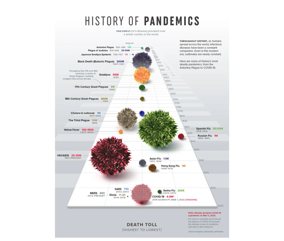
Visualizations are not merely diagnostic; they are inherently communicative. The form a designer chooses determines whether understanding emerges or is lost in the noise. For example, Visual Capitalist’s "History of Pandemics" infographic uses a proportional bubble layout on a single timeline rather than a dense data table. This design allows the human visual system to grasp the staggering scale of the Black Death relative to other historical events before a single label is processed. This illustrates the principle that effective design makes the story impossible to miss, leveraging pre-attentive attributes—visual properties that our brains process in milliseconds without conscious effort.
Edward Tufte, a pioneer in the field, codified this with the "data-ink ratio," suggesting that every mark on a chart should serve the data rather than decorate it. While clarity and visual hygiene are essential, modern UX-driven data design suggests that simplicity is not an absolute virtue. Instead, "appropriate complexity" is the goal. Data is a message, and the required signal strength depends entirely on the recipient’s context and needs.

The 80/20 Rule of Data UX
The success of a dashboard is largely determined before a single chart is drawn. Approximately 80% of the high-leverage work happens upstream, involving the identification of context, audience, and intended insight.
1. Defining Context and Operational Questions
Most data projects suffer from being "data-first" rather than "question-first." Teams often pull every metric available in their analytics tools, creating a "data graveyard" of charts that answer no specific query. A context-first approach begins with a constraint. For instance, rather than asking to "see how the product is performing," a high-leverage question would be: "Identify which features drive retention among users who signed up in Q1." This query includes a specific metric, a defined population, and an implied action. By narrowing the scope, designers can filter out 90% of the noise, ensuring every element on the screen earns its place.
2. Audience Accountability and Familiarity
Designing for an audience requires an understanding of their data literacy (familiarity) and their professional stakes (accountability). An analyst requires a high-density environment to conduct diagnostic discovery, mapping raw user flows to uncover hidden friction points. Conversely, an executive needs a highly synthesized translation of that data to make rapid commercial decisions. Tailoring a dashboard involves adjusting the "density dial"—delivering the maximum signal with the appropriate level of complexity for the specific user.

3. From Information to Insight
There is a critical distinction between information (what the data shows) and insight (the decision made as a result). A dashboard built for information might show a 15% drop in booking rates, triggering a panic-driven "fire drill" across the organization. A dashboard built for insight, however, would map that drop against traffic sources and campaign launches. This might reveal that the drop was caused by an influx of low-intent traffic from a new marketing campaign, rather than a failure in the product’s UX. The insight allows the team to adjust marketing spend rather than wasting resources on unnecessary product redesigns.
Case Study: Enterprise Talent Management and Competency Tracking
The practical application of these principles was recently demonstrated in a project for a B2B SaaS platform focused on enterprise talent management. The platform held an immense archive of user activity and telemetry data. The challenge was to present this data to enterprise teams in a way that actually fostered professional growth.
The project began by defining what "better performance" actually meant in a measurable sense. While "time spent on the platform" was an easy metric to track, it was deemed a mere proxy for engagement. Instead, the design team focused on competency scores, certification completion rates, and historical performance trajectories.

The audience was split into two primary groups: individual contributors and managers. The individual contributor’s workspace was designed to be a "self-directed mirror," showing them exactly where they stood in their skill development. For managers, the interface provided a "macro pulse check" on team vulnerabilities, allowing them to see where the group was progressing and where critical gaps existed.
A key design choice was the use of radar charts for multi-dimensional analysis. By mapping eight distinct competency areas across axes radiating from a central point, the interface allowed users to see their "skill shape" at a glance. A balanced polygon indicated well-rounded proficiency, while a skewed shape immediately highlighted a vulnerability. This radial layout proved far more effective than a traditional bar chart, which would have required the user to mentally calculate the variance between eight separate bars.
Chronology of Data Visualization Evolution
To understand the current state of data UX, it is helpful to look at the timeline of how organizations have historically interacted with data:

- Pre-1970s: Data was largely static, confined to physical ledgers and printed reports. Visualization was a specialized task for cartographers and scientists.
- 1970s–1980s: The rise of mainframe computing and early spreadsheet software (like VisiCalc) allowed for the first digital manipulation of data, though visualization remained rudimentary.
- 1990s–2000s: The democratization of the Personal Computer and tools like Microsoft Excel made basic charting accessible to the average office worker. However, this led to the "clutter era," characterized by 3D pie charts and excessive decoration.
- 2010s: The "Big Data" explosion led to the rise of sophisticated BI tools like Tableau and Power BI. Organizations began to focus on real-time dashboards, but often fell into the trap of "data for data’s sake."
- 2020s–Present: The current era is defined by "Data UX." The focus has shifted from the quantity of data to the quality of the interface, emphasizing user-centered design to drive actionable insights.
Broader Impact and Organizational Implications
The shift toward a UX-centric approach to data visualization has profound implications for organizational efficiency. In the case of the talent management platform, the deployment of personalized, insight-driven dashboards led to a measurable increase in weekly active engagement. Managers reported that the tools allowed them to shift from reactive "post-mortems" to proactive guidance.
Furthermore, qualitative data indicates that when dashboards are designed with the user in mind, "data fatigue" decreases. Employees are more likely to trust and use tools that provide a clear narrative rather than those that require extensive cognitive effort to decipher. From a financial perspective, this reduces churn in SaaS platforms and improves the ROI of internal data initiatives.
As organizations move forward, the role of the "Data Designer" or "UX Analyst" will become increasingly vital. The objective is no longer just to show the data, but to ensure the data performs. By treating visual presentation as an upstream architectural choice rather than a downstream formatting step, companies can ensure that their data serves a human purpose. The ultimate goal of any visualization is to stop being a passive log of the past and start being a strategic map for the future.

