
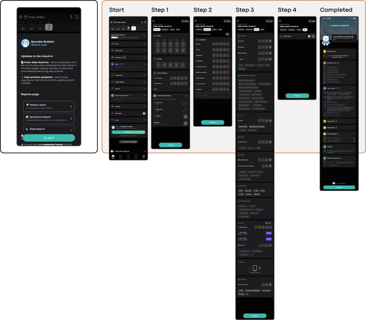
The digital mental health sector is currently grappling with a severe engagement crisis as industry data reveals that nearly 95% of users who download a mental health application abandon the platform within the first 30 days of use. Despite a global surge in the demand for mobile health (mHealth) solutions, research indicates a fundamental disconnect between modern user interface (UI) trends and the psychological needs of individuals in distress. While traditional tech industries prioritize "capturing attention" and "signaling innovation," these goals frequently conflict with the core requirements of mental health support: reducing cognitive strain, fostering long-term trust, and providing a sense of digital refuge.

The Retention Crisis: A Statistical Overview of mHealth Abandonment
The scale of the engagement collapse in the mental health app market is historically high compared to other software verticals. According to data published in the Journal of Medical Internet Research (JMIR), the median 30-day retention rate for mental health apps stands at a mere 3.3%. Even market leaders and "giants" in the space—platforms with multi-million dollar budgets—report losing approximately 50% of their user base within the first ten days of installation.

Industry analysts suggest that while many factors contribute to this churn, including the inherent difficulty of habit formation and the symptoms of the conditions themselves, the interface design serves as a primary clinical and operational barrier. For a user experiencing high levels of anxiety, depression, or exhaustion, an unconventional icon or a flashy, high-contrast animation is not a "delightful surprise"; it is an additional cognitive load that triggers disengagement.

Chronology of the mHealth Design Evolution
To understand the current tension, it is necessary to trace the evolution of mental health technology over the last decade.

- The Clinical Phase (2010–2015): Early mental health apps were largely digitized versions of clinical worksheets. They were functional but lacked aesthetic appeal, leading to low adoption rates outside of formal therapy.
- The Gamification Boom (2016–2020): Following the success of apps like Duolingo, developers began integrating streaks, badges, and bright, "happy" aesthetics into wellness tools. This era saw the rise of Headspace and Calm, which successfully used high-production value to reach a mass audience.
- The Attention Economy Conflict (2021–Present): As the market became saturated, apps began adopting aggressive UI trends—such as Neo-brutalism, gesture-heavy navigation, and "dark patterns" of persuasion—to stand out in crowded app stores.
The current period is defined by a growing realization among UX researchers, including Kat Homan, that these attention-grabbing trends are often counter-therapeutic. The industry is now entering a "Correction Phase," where designers are being urged to prioritize "therapeutic usability" over visual fashion.

The Five Fronts of Design Conflict
Designers and clinical psychologists have identified five specific areas where modern UI trends actively undermine the goals of mental health applications.

1. Cognitive Friction and Executive Dysfunction
The primary goal of a mental health tool is to reduce cognitive load. However, trends like Neo-brutalism, characterized by stark contrasts and heavy borders, require significant visual parsing. Similarly, the trend toward "minimalist" navigation—where menus are hidden behind non-standard swipes—turns simple tasks into puzzles. For a user in a state of crisis, whose executive function may already be impaired by depression or brain fog, these "innovative" layouts become physical barriers to help.

2. Emotional Mismatch and Visual Tone
Research into the influence of color and aesthetics on mood suggests that users in distress often find bright, "cheerful" colors jarring or even physically uncomfortable. A study published in the journal Health Informatics indicates that distressed users show a strong preference for subtle, dark palettes and clean, uncluttered aesthetics. When an app uses high-saturation "celebratory" colors for a user who has just logged a low mood, it creates an emotional mismatch that erodes trust.

3. The Inconsistency Penalty
Mental health recovery is often built on routine and predictability. Contemporary UI trends, however, thrive on novelty and disruption. When an app updates its interface to include unique button behaviors or "playful" new animations, it forces the user to relearn the tool. For someone managing a chronic condition, the lack of a stable information architecture can be exhausting. Successful public-health-oriented tools, such as PTSD Coach, maintain a rigid, predictable structure specifically to support return use during moments of high stress.

4. The Silent Exclusion of Accessibility Needs
Popular trends often compromise accessibility. Minimalist low-contrast text fails users with visual impairments, and gesture-only navigation marginalizes those with motor difficulties. Given that the population seeking mental health support disproportionately includes individuals with these accessibility needs, choosing a "trending" aesthetic over a compliant one (such as WCAG 2.2 standards) is an active decision to limit the app’s efficacy.

5. The Coercion Paradox
Engagement mechanics designed for entertainment—such as streaks and aggressive notifications—can transform into sources of performance pressure. For a user managing depression, a "broken streak" is not a motivator; it is a visible record of failure that exacerbates guilt. This "Coercion Paradox" occurs when a retention mechanic designed to help a user actually gives them a reason to delete the app to avoid further shame.

Industry Responses and Best Practices
In response to these findings, several developers have begun implementing "state-aware" interactions that adjust to the user’s current capacity.

- Bear Room: This stress-reduction app utilizes a "muted palette" of earthy tones and soft greens to create a digital safe space. Instead of complex dashboards, it uses a guided flow with visible entry points (e.g., a central "Start" sign) to ensure the path to support is always clear.
- Teeni: Designed for parents of teenagers, this app introduces a "Quick Relief" button. This feature allows for a "Hot Flow"—where users can vent immediate frustration via voice input—before guiding them into more reflective content once they have regulated their emotions.
- Nonori: This platform avoids large content libraries in favor of a simple, linear sequence of small actions, reducing the "paradox of choice" that often paralyzes anxious users.
Official Data and Global Implications
The stakes for improving mental health app design are global. The World Health Organization (WHO) estimates that approximately one billion people worldwide live with a mental disorder. Since the onset of the COVID-19 pandemic, global cases of depression and anxiety have increased by an estimated 25%.

The WHO has highlighted an urgent need to scale up mental health services, noting that digital tools are essential for reaching underserved populations. However, if these tools continue to suffer from a 95% abandonment rate due to design-driven friction, the digital health revolution will fail to meet its potential.

A Practical Evaluation Framework for Designers
To bridge the gap between design and therapy, Kat Homan and other industry experts suggest a five-point evaluation framework for any new UI element:

- Capacity Check: Does this design lower the cost of use for someone in a low-capacity state?
- Emotional Fit: Does the visual tone respect the user’s likely emotional reality?
- Reliability: Is the navigation stable and predictable enough for a distressed user?
- Inclusion: Does the design meet or exceed WCAG accessibility standards?
- Pressure Assessment: Does this engagement mechanic provide support or create performance guilt?
Conclusion: The Shift Toward "Quiet Help"
The consensus among mHealth researchers is that sustainable retention in mental health technology is earned through respect, not attention. While "Dribbble-style" shots and high-energy animations may win design awards, they often fail the end-user at their moment of greatest need.

The ultimate goal of a mental health interface is to become a "quiet helper"—a tool that does not steal the spotlight but allows the therapeutic support to be felt. As the global mental health crisis continues to grow, the responsibility of the UI designer is shifting from "creating innovation" to "removing barriers," ensuring that the interface itself never becomes an obstacle to healing.

