
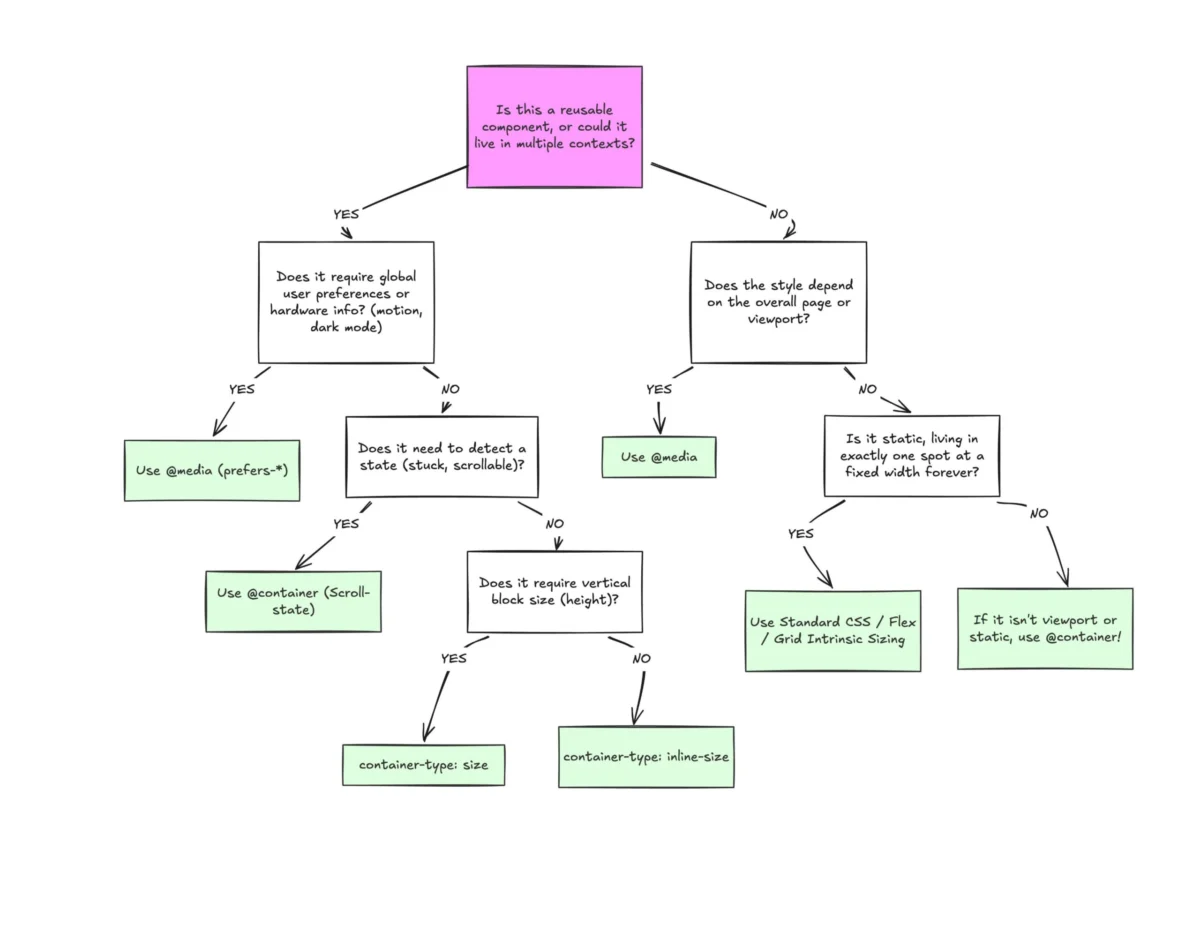
The landscape of modern web development is currently navigating a significant paradigm shift as CSS Container Queries transition from a long-awaited experimental feature to a stable, cross-browser standard. Despite reaching a milestone of approximately 94% browser support across all major engines—including Chrome, Firefox, Safari, and Edge—the adoption rate of this technology remains disproportionately low compared to its perceived value within the developer community. Recent industry data reveals a stark disconnect: while awareness of container queries has climbed to over 86% among professional developers, actual implementation in production environments hovers at just 41.4%. This gap highlights a broader challenge in the front-end ecosystem, where established patterns centered on media queries continue to dominate, even as they struggle to meet the demands of highly modular, component-based design systems.
The Architectural Shift from Macro to Micro Layouts
For over a decade, responsive web design has been synonymous with Media Queries. Introduced as a cornerstone of the responsive movement in 2010, the @media rule allows developers to adjust layouts based on the global properties of the viewport. However, as the industry moved toward component-driven architectures—popularized by frameworks like React, Vue, and Web Components—the limitations of viewport-relative styling became a primary point of friction.
The fundamental issue lies in the fact that media queries treat the viewport as a proxy for the space available to a component. This "macro" approach works efficiently for page-level structural changes, such as shifting a sidebar below the main content on mobile devices. However, it fails in "micro" layout scenarios where a single component, such as a card or a navigation widget, must appear in multiple contexts across a site. A card placed in a wide hero section requires a horizontal layout, while the same card placed in a narrow sidebar requires a vertical layout. Under a media-query-centric model, the card has no inherent knowledge of its parent container’s width, leading to brittle code that relies on complex CSS classes or JavaScript-based ResizeObservers to adapt.
Container queries resolve this by allowing elements to query their own parent container’s size. This enables a component to be truly "self-responsive," adapting its internal layout based on the specific space it occupies rather than the total width of the browser window.

Chronology of Development and Browser Support
The journey to standardized container queries was marked by years of technical hurdles and community advocacy. The feature was frequently cited as the "most wanted" CSS enhancement in annual industry surveys for nearly a decade before becoming a reality.
- 2010–2015: The rise of Responsive Web Design (RWD) highlights the need for element-based queries. Early proposals are met with concerns regarding "infinite loops," where a query changes an element’s size, which in turn invalidates the query.
- 2020: The CSS Working Group makes a breakthrough with the CSS Containment Module Level 3. By requiring developers to explicitly define a "container-type," the browser can isolate the layout of the container from its contents, preventing circular dependencies.
- 2021: Google Chrome 91 introduces experimental support for container queries behind a flag.
- 2022–2023: The "Interop 2023" initiative, a collaborative effort between Google, Apple, Microsoft, and Mozilla, identifies container queries as a key focus area for cross-browser compatibility. By early 2023, all major browsers ship stable support for the feature.
- 2024–2025: Despite universal support, the industry enters a period of "adoption inertia," where legacy projects and established workflows slow the transition to container-based logic.
Analyzing the Adoption Gap: Data and Expert Reactions
The discrepancy between awareness and usage was a central theme at the SmashingConf Amsterdam 2026 conference. Expert speakers, including noted CSS educator Kevin Powell, characterized the current state of adoption as "terrible" relative to the feature’s utility. Powell noted that many developers mistakenly view container queries as a direct replacement for media queries rather than a complementary tool.
Statistical evidence from the State of CSS survey supports this observation. The 41.4% usage rate suggests that while developers recognize the name, the mental model required to implement container queries effectively has not yet become second nature. Furthermore, viewport fragmentation data indicates that there are now over 2,300 unique viewport sizes regularly accessing the modern web. Relying solely on a handful of media query breakpoints (e.g., 768px or 1024px) is increasingly viewed as an inadequate strategy for managing this diversity.
Industry analysts suggest that the slow uptake is partially due to the "wrapper requirement." Unlike media queries, which can be applied to any element at any time, container queries require a defined parent-child relationship. An element cannot query its own dimensions; it must query a parent that has been explicitly declared as a container via the container-type property. This additional layer of markup and CSS declaration represents a barrier to entry for developers accustomed to the flatter structure of traditional CSS.
Technical Implementation and Internal Logic
The technical implementation of container queries introduces several new properties and units designed to facilitate fluid, component-centric design.

Defining Containers
To enable a container query, a developer must first establish a containment context:
.parent-element
  container-type: inline-size;
  container-name: sidebar-widget;
The inline-size value is the most common, as it allows the container to respond to changes in width (horizontal space). Using container-type: size requires the browser to ignore the height of the container’s children when calculating layout, which can lead to layout collapse if an explicit height is not provided.
Querying Space
Once the container is defined, child elements can be styled conditionally:
@container sidebar-widget (min-width: 400px)
  .child-component
    display: grid;
    grid-template-columns: 1fr 2fr;
Container Query Units
A significant enrichment of the CSS specification is the introduction of Container Query Length units. These function similarly to viewport units (vw, vh) but are relative to the container:
- cqi: 1% of a query container’s inline size.
- cqw: 1% of a query container’s width.
- cqb: 1% of a query container’s block size.
- cqh: 1% of a query container’s height.
These units are particularly effective for fluid typography. By using font-size: clamp(1rem, 0.5rem + 3cqi, 2rem), a developer ensures that text scales perfectly based on the component’s width, whether it is positioned in a narrow column or a wide gallery.

Official Responses and Strategic Recommendations
Browser vendors and the CSS Working Group have responded to the adoption lag by emphasizing "Interop" and documentation. The consensus among CSS architects is that the future of web design requires a clear separation of concerns:
- Media Queries for Macro Layouts: Use
@mediafor global concerns, such as page-level grids, headers, footers, and user preferences likeprefers-color-schemeorprefers-reduced-motion. - Container Queries for Micro Layouts: Use
@containerfor all reusable components, including cards, form inputs, and navigation patterns.
This dual-track approach ensures that components remain portable. A component styled with container queries can be moved from a sidebar to a main content area, or even shared across different projects, without needing to rewrite the responsive logic.
Broader Implications for Design Systems and Performance
The long-term implications of container queries extend beyond syntax. For design systems, this technology bridges the gap between design tools like Figma—which utilize "Auto Layout" and container-based constraints—and the final code. When developers build components that respond to their environment, they reduce the need for "conditional prop drilling" in JavaScript frameworks, where a developer might pass a layout="compact" prop to a component based on its placement.
From a performance perspective, container queries offer a more efficient alternative to JavaScript-based layout detection. Modern browsers optimize CSS containment at the engine level, allowing for smoother layout shifts and reduced main-thread activity compared to ResizeObserver callbacks.
As the web continues to fragment across an infinite variety of screen sizes and foldable devices, the move away from viewport-dependency is not merely a preference but a necessity. While the current adoption rates for container queries are lower than anticipated, the stabilization of the specification and the increasing complexity of component-based UI suggest that they will eventually become the default standard for responsive styling. The transition marks the end of the "viewport-as-proxy" era and the beginning of a truly modular web.

