
The failure of a brand identity project is rarely the result of poor technical execution or a lack of artistic talent; instead, it is almost always rooted in the conceptual void that exists between strategy and design. In the contemporary design landscape, the most effective visual concepts do not originate within digital tools like Figma or Adobe Creative Suite. Rather, they are forged in a rigorous "pre-concept" phase—a period of strategic alignment where abstract adjectives are translated into concrete visual boundaries. This phase serves as a vital bridge, ensuring that the final creative output is not merely a subjective "guess" but a logical extension of a shared brand direction.
Industry data suggests that the stakes for this alignment are exceptionally high. According to the 2021 Brand Consistency Report, consistent brand presentation can increase revenue by up to 33%. However, achieving this consistency requires more than just a style guide; it requires a deep, shared understanding of what the brand represents before the first pixel is moved. When stakeholders use broad terms like "modern," "trustworthy," or "disruptive" without a unified definition, they create a "perception gap." A designer might interpret "modern" as minimalist and stark, while a CEO might interpret it as vibrant and high-tech. Without a pre-concept phase to reconcile these differences, the resulting design often fails to resonate with the intended audience.
The Chronology of Modern Brand Development
To understand where the pre-concept phase fits, it is necessary to examine the typical lifecycle of a branding project. In traditional workflows, projects often move directly from a "discovery" meeting to "concept presentation." The pre-concept methodology introduces a deliberate buffer between these stages.
- Phase 1: Discovery and Kickoff: The team collects the project brief, conducts stakeholder interviews, and reviews competitor references.
- Phase 2: Strategic Research and Context (The Pre-Concept Start): This involves deep-diving into the brand’s perception, uncovering hidden assumptions, and identifying the "category codes" that govern the industry.
- Phase 3: Visual Foundation Building: Exercises like perception mapping and visual brand drivers are used to create a "design code"—a set of visual principles that guide the aesthetic direction.
- Phase 4: Concept Development: Only after the foundation is agreed upon does the designer begin creating original logos, color systems, and typography.
- Phase 5: Implementation and Asset Delivery: The final concepts are refined into a working system for product teams and marketing.
By spending more time in Phases 2 and 3, agencies report a significant reduction in the number of revision rounds required during Phase 4, often cutting the concept approval time by as much as 40%.
Uncovering Semantic Ambiguity in Stakeholder Interviews
The primary objective of the pre-concept phase is to clarify perception. As noted by brand strategist Marty Neumeier in The Brand Gap, "A brand is a person’s gut feeling about a product, service, or company." Because a brand lives in the perception of the audience, the design team must first identify what perception they are trying to engineer.

During stakeholder workshops, specific "perception questions" are used to move past surface-level adjectives. Instead of asking what the brand is, designers ask what the brand should make people believe. For example, in a recent case study involving a health tech firm, the stakeholders insisted on a "disruptive" identity. However, deeper inquiry revealed that their primary clients were government medical institutions—entities that value stability over rebellion. In this context, "disruption" had to be visually translated as "extreme efficiency" and "unmatched clarity" rather than loud colors or unconventional layouts.
This realization saved the project from a common pitfall: creating a visual system that the client technically asked for but that the market would ultimately reject.
Analytical Tool: Competitor Perception Mapping
One of the most effective methods for defining visual boundaries is Competitor Perception Mapping. This exercise requires stakeholders to plot existing industry players on a two-axis grid. The axes are typically defined by the inherent tensions the brand must navigate, such as:

- Traditional vs. Progressive
- Corporate vs. Human
- Understated vs. Bold
- Accessible vs. Exclusive
The value of this exercise lies in the disagreement it fosters. When one executive places a competitor in the "bold" quadrant and another places them in "generic," it reveals a fundamental difference in how they perceive the market. Resolving these discrepancies during the pre-concept phase prevents them from surfacing as "I just don’t like it" during the final concept review.
The Visual Brand Driver: Thinking Through Metaphor
Moving from words to images requires a transitionary exercise known as the Visual Brand Driver. Stakeholders are asked to select images from unrelated categories—such as transportation, architecture, or furniture—that embody the company’s spirit.
For instance, if a fintech brand is likened to a "high-speed train," it implies attributes of reliability, fixed routes, and mass accessibility. If it is likened to a "private jet," it suggests exclusivity, speed, and bespoke service. Each stakeholder must provide adjectives to justify their choice, allowing the designer to identify patterns. If the majority of stakeholders choose "modular furniture" and "quiet electric vehicles," the designer knows to steer the visual identity toward precision, sustainability, and understated efficiency.

Translating Strategy into a Visual Foundation
Once the research and workshops are complete, the findings are synthesized into three layers of visual direction: Look and Feel, Design Code, and Brand Assets.
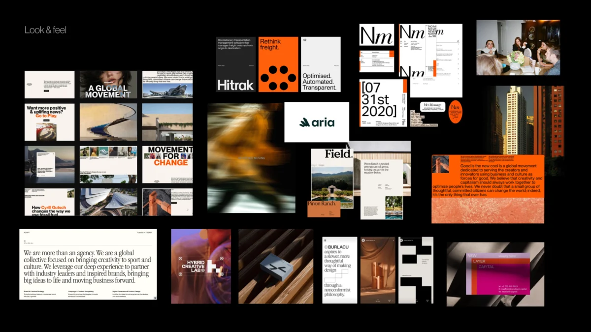
Look and Feel (Perception Boards)
Unlike traditional moodboards, which often focus on "pretty" images, perception boards are curated to test specific brand directions. If the goal is to be "trustworthy but modern," the designer might present two boards: one that leans into "institutional trust" (stable, serif-heavy, muted tones) and another that leans into "innovative trust" (clean, sans-serif, high-contrast). The client’s reaction to these boards establishes the aesthetic "vibe" without committing to a specific logo.
Design Code (Visual Principles)
The Design Code translates brand values into specific design maneuvers. For a parenting application, the value "support for your unique journey" might be translated into a design code of "organic shapes and handwritten lines." The value "research-backed credibility" might be translated into "modular infographics and editorial layouts." This step ensures that every design choice made later in the process can be traced back to a strategic requirement.

Brand Assets (The Building Blocks)
The final step of the pre-concept phase is discussing the early directions for typography, color palettes, and photography styles. By agreeing that the brand should use "warm, human-centric photography" and "bold, geometric typography" before the concepts are built, the designer eliminates thousands of incorrect paths, focusing their creative energy on the most viable solutions.
Official Responses and Industry Perspectives
Design leaders across the globe have begun to champion this "slow design" approach. Sarah Drummond, a prominent service designer, has argued that "designing without research is like painting a room with your eyes shut." Similarly, creative directors at top-tier agencies like Pentagram and Wolff Olins have long utilized "strategic immersion" periods that mirror the pre-concept phase described here.
In a recent industry roundtable, one CMO of a Silicon Valley unicorn noted, "The projects that succeeded were the ones where we spent the first month just talking about what words meant. The projects that failed were the ones where we rushed into Figma in week two."

Broader Impact and Implications for the Design Industry
The shift toward a robust pre-concept phase has significant implications for the future of the creative economy. As Artificial Intelligence (AI) becomes increasingly capable of generating high-fidelity visual assets in seconds, the role of the human designer is shifting from "maker" to "curator and strategist."
AI can generate a hundred logos in the time it takes a human to sketch one, but AI cannot sit in a boardroom and navigate the complex emotional and strategic disagreements between a CEO and a CMO. The pre-concept phase is where the "human" value of design is most evident. It is the process of building consensus, empathy, and strategic logic.
Furthermore, this methodology provides a framework for "de-risking" the creative process. For businesses, branding is a major investment. By utilizing a pre-concept phase, agencies can provide clients with a higher degree of certainty. When the first concept is finally revealed, it should not feel like a surprise; it should feel like the inevitable conclusion of a logical journey.

Conclusion: The First Concept Should Not Be a Guess
Ultimately, the pre-concept phase is about creating a "sharper problem" for the designer to solve. When the boundaries are clearly defined—when the team knows they are looking for "understated boldness" that feels "institutional yet human"—the creative process becomes more focused and more powerful.
By researching brand context, uncovering hidden stakeholder assumptions, and building a shared visual foundation, teams can bridge the gap between abstract strategy and tangible design. This approach ensures that the resulting brand identity is not just a beautiful artifact, but a strategic tool capable of driving long-term business value and authentic audience connection. In an era of rapid digital transformation, the most successful brands will be those that take the time to define themselves before they ever attempt to design themselves.

